


Dr. Joe Perez is a game-changing professional who has made an impressive impact on the world of IT, health & human services, and higher education. With advanced degrees in education, Joe started his career as an educator and continued to further his education by earning a doctorate in education with a double minor in computers and theology. His career focus changed to IT in the early 1990’s when he started working as a Computer Consultant at NC State University. Three promotions later, Dr. Perez ended his successful 25-year career at NC State as Business Intelligence Specialist when he took another promotion to become Senior Business Analyst at the NC Department of Health & Human Services (DHHS) in the fall of 2017.
Notably, Dr. Perez has been featured on multiple billboards in the iconic Times Square, a testament to his remarkable achievements and influence worldwide. This recognition, along with his Top 10 Global Thought Leader Rankings in IT Strategy & Big Data on Thinkers360 (2023 through 2025) and Gartner Peer Community Ambassador of the Year (2023-2024), reflect his dedication and impact in the industry.
Having achieved significant success throughout his career, Dr. Perez's accomplishments include being promoted to Senior Systems Specialist and Team Leader, a position he has excelled in while showcasing his expertise and leadership skills. In addition to his full-time analytics/BI leadership role at DHHS, Joe was named fractional Chief Technology Officer at a North Carolina firm in October 2020 and Strategy Director at InnovoraMind in March 2026. A prolific, Amazon bestselling author with multiple #1 new releases, more than 21,000 followers on LinkedIn, and several professional certifications, he has consistently proven to be a much sought-after resource, highly-recommended international keynote speaker, data analytics & visualization expert, and specialist in efficiency and process improvement.
Perez, a recipient of the IOT Industry Insights 2021 Thought Leader of the Year award, speaks at numerous conferences each year, and continues to be in high demand to this day, expanding his reach into dozens of countries around the globe, impacting thousands. Thanks to these outstanding accomplishments and influential presence as a leading expert in the industry, Dr. Perez has been welcomed into several prestigious Thought Leader communities. He was recently inducted into the United Nations Global Network of Data Officers and Statisticians and was selected to be a Distinguished Fellow in the Public Sector Network's Future Government Institute.
Dr. Perez's passion for teaching has never waned, whether as a speaker, workshop facilitator, podcast guest, conference emcee, or team leader; inspiring countless individuals to strive for excellence. He cherishes spending time with his wife and children, who he considers to be the "best things that ever happened to me." Besides being a gifted musician, singer, pianist, and composer, Joe serves in his church's Hispanic ministry. He even manages to publish a monthly military newsletter, The Patriot News, which has gained widespread recognition. His unwavering commitment to his community is an inspiration to all. To stay in shape, Perez hits the gym, and he loves watching Star Trek reruns to relax. "I'm a firm believer that if I'm not innovating, then I'm stagnating," says Joe. His devotion to innovation, his boundless energy, and his constant drive for excellence are the hallmarks of a truly exceptional individual, thus making Dr. Joe a perfect fit to inspire and engage your audience, leaving a lasting impact on your event.
Available For: Advising, Authoring, Consulting, Influencing, Speaking
Travels From: Raleigh, North Carolina
Speaking Topics: Data Visualization, Data Governance, Data Management, Facilitating Innovation, Professional Development
| Dr. Joe Perez | Points |
|---|---|
| Academic | 0 |
| Author | 846 |
| Influencer | 255 |
| Speaker | 361 |
| Entrepreneur | 0 |
| Total | 1462 |
Points based upon Thinkers360 patent-pending algorithm.

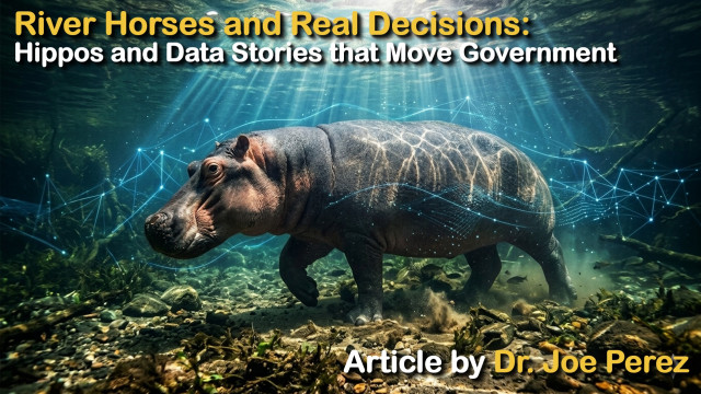 River Horses and Real Decisions: Hippos and Data Stories that Move Government
Tags: AI, Analytics, Big Data
Tags: Big Data
 From Wallpaper Cleaner to World-Changer: Play-Doh and Data Governance
Tags: AI, Analytics, Big Data
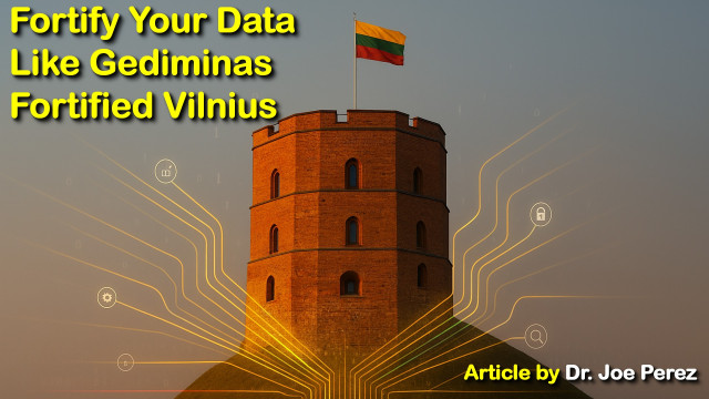 Fortify Your Data Like Gediminas Fortified Vilnius
Tags: AI, Analytics, Big Data
 The Man Who Saved Stonehenge: A Timeless Lesson in Business Ethics
Tags: IT Leadership
 When Dreams and Data Tell Tales
Tags: Analytics, Big Data
 Avoiding the “Death by PowerPoint” Trap: Four Essential “E’s” for Effective Speaking—Part 2
Tags: Coaching, IT Leadership
 From Space Missions to Kung Fu Pandas: A Surprising Tale of Lean Data Governance
Tags: Analytics, Big Data
 From Atomic Warfare to Data Warfare
Tags: Analytics, Big Data
 The Quantum Leap: 7 Tips to Expand Your Network in Data Governance
Tags: Analytics
 The Ripple Effect of Kindness: A Transformative Leadership Lesson from History`
Tags: IT Leadership, Leadership
 Avoiding the "Death by PowerPoint" Trap (part 1)
Tags: Coaching, IT Strategy
 Flying High in the Data Sky: How Analytics Keeps Us Warm in a Cold World
Tags: Analytics, IT Leadership, Creativity
 Winning a Race Posthumously: Inspiration for Data Management
Tags: Analytics, Big Data, IT Strategy
 Visionary Realism: The Art of Blending Innovation and Practicality
Tags: Analytics, Innovation
Tags: Analytics, Coaching
 Data Governance: Your Digital Lifeline
Tags: Analytics, Big Data
 From Ancient Ice Houses to Modern Data Vaults: Navigating Data Governance Challenges
Tags: Analytics, Big Data
 Conducting Insights: From Copper and Aluminum to the Art of Data Storytelling
Tags: Analytics
 Masterpieces of Engineering: Unleashing Creativity in Lean Data Governance
Tags: Analytics, Creativity
 Decrypting Trust through Clear Communication in Data Analytics
Tags: Analytics
 Grasshoppers’ Belly Ears and Data Analytics: Unconventional Listening and Predictive Insights
Tags: Analytics
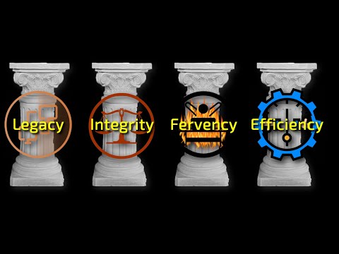
 The Pillars of Lean Data-Driven Success
Tags: Analytics, Big Data
 Crunching Numbers, Cultivating Minds: Data's Role in Modern Education
Tags: Analytics, Big Data
 The Italian Data-Stallion
Tags: Analytics, Big Data
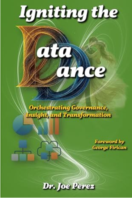
 Igniting the Data Dance: Orchestrating Governance, Insight, and Transformation
Tags: Analytics, Big Data, IT Strategy
 From Numbers to Narratives that Transform Businesses: Harnessing the Power of Data Visualization
Tags: Analytics, Big Data, Creativity
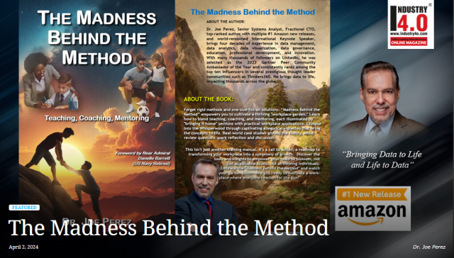
 The Madness Behind the Method: Teaching, Coaching, Mentoring (RANKED #1 NEW RELEASE ON AMAZON!)
Tags: Analytics, Big Data, IT Strategy
 Unleashing Firepower: Masters of Business Excellence
Tags: Analytics, Big Data, IT Strategy
 Book of the Month: Igniting the Data Dance
Tags: Big Data
 Review of The Madness Behind the Method
Tags: Coaching
 Book Synopsis: Method Behind the Madness
Tags: Coaching
 Captivating Audiences with Data: Lea Pica's Data Storytelling Masterpiece
Tags: Analytics, Big Data
 Mentoring Mastery: Igniting Greatness and Nurturing a Legacy
Tags: Coaching, IT Leadership
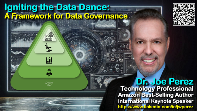 Igniting the Data Dance: Data Governance Framework
Tags: Analytics, Big Data
 Driving Decisions with Scalable Data
Tags: Analytics, Big Data
 When a Tool is Not a Tool: AI Gone C.O.L.D.
Tags: AI, Analytics, Big Data
 Unlocking the Vault: Lessons from History on Overcoming Barriers to Business Analytics
Tags: Analytics, Big Data
 S.T.E.P. Into Data-Driven Leadership
Tags: IT Strategy, Leadership
 Igniting the Data Dance for Data Governance
Tags: Analytics, Big Data
 Making the Madness Behind the Method
Tags: Coaching
Tags: AI, Analytics, Big Data
Tags: Analytics, Big Data
Tags: Analytics, Big Data
Tags: Analytics, Big Data
Tags: Analytics, Big Data
 AI Fundamentals for Business
Tags: Analytics, Big Data
 Empowering Business Analysts: Data-Driven STEPS; to Leadership Strategy
Tags: IT Strategy
 Driving Decisions with Data in Procurement
Tags: IT Strategy, Big Data
 Driving Decisions with Data in IT
Tags: IT Strategy, Big Data
 Leveraging Beauty & Brains for Effective Data Storytelling
Tags: Analytics, Big Data, IT Strategy
 Creating a Data-Driven Strategy: The Right “S.T.E.P.”
Tags: Big Data, Business Strategy
 Creating a Data-Driven Business Analysis Strategy: The Right S.T.E.P.
Tags: Analytics, Big Data, IT Strategy
Tags: Analytics, Big Data

Tags: Analytics, Big Data

Tags: Analytics, Big Data

Tags: AI, Analytics, Big Data

Tags: Analytics, Big Data

Tags: Innovation, IT Leadership
Tags: AI, Analytics
Tags: Analytics, Innovation
 Perceptions on Data, Strategy, and Innovation with Dr. Joe Perez
Tags: Analytics, Innovation
 Book Nook Interview with Author Dr. Joe Perez
Tags: Coaching
Tags: Analytics, Big Data, Coaching

Tags: Analytics, Big Data

Tags: IT Leadership, IT Strategy
Tags: Analytics, Big Data

Tags: Innovation, IT Strategy, IT Leadership
 Meet Dr. Joe Perez
Tags: Analytics, Big Data, IT Strategy

Tags: Analytics, Big Data, IT Leadership

Tags: Innovation, IT Leadership, Leadership
Tags: Analytics, Big Data, IT Leadership

Tags: Analytics, Big Data, Innovation
Tags: Analytics, Big Data, IT Leadership

Tags: Analytics, Big Data, IT Leadership
Tags: Big Data, Innovation, IT Leadership

Tags: Big Data, Change Management, Innovation
Tags: Analytics, Big Data, IT Leadership
Tags: Analytics, Big Data, IT Leadership
 Discussing Digital Transformation
Tags: Analytics, Big Data

Tags: Analytics, Big Data, Leadership

Tags: Analytics, Big Data, Digital Transformation

Tags: Big Data, IT Strategy, Leadership
Tags: Analytics, Big Data, IT Strategy
 Peer Ambassador of the Year Announcement
Tags: Analytics, IT Strategy
Tags: Coaching, GRC
Tags: Analytics, Big Data, IT Strategy
Tags: Analytics, Big Data, IT Leadership
Tags: Analytics, Big Data, IT Leadership
Tags: Analytics, Big Data, IT Leadership
Tags: Analytics, Big Data, IT Leadership
Tags: Analytics, Big Data, IT Leadership
Tags: Analytics, Big Data, IT Leadership
Tags: Analytics, Big Data, IT Leadership
Tags: Analytics, Big Data, IT Leadership
Tags: Analytics, Big Data, IT Leadership
Tags: Analytics, Big Data, IT Leadership

Tags: Big Data, Innovation, IT Leadership

Tags: Innovation, IT Leadership, Social
Tags: Analytics, Big Data, IT Leadership

Tags: Big Data, IT Leadership

Tags: Big Data, Innovation, IT Leadership
Tags: Analytics
 Dr. Joe CDO Magazine Profile
Tags: Analytics, Big Data
Tags: Analytics
 Most Active Speaker
Tags: Analytics
Tags: Analytics, IT Strategy, Leadership
Tags: Analytics, Big Data, IT Strategy
Tags: Analytics, Big Data, IT Strategy
Tags: Analytics, Big Data
 Humanizing Strategic Sourcing & Procurement Webinar
Tags: Coaching, Education
 Driving Decisions with Data at ElevateIT
Tags: Analytics, Big Data, Education

Tags: Coaching, IT Leadership, GRC
Tags: Innovation, Leadership
 Making the Madness Behind the Method
Tags: HR, Innovation, Leadership
 Driving Decisions with Data in AI
Tags: Analytics
 The Art and Science of Effective Data Storytelling
Tags: Analytics, Big Data, IT Strategy

Tags: Analytics, Big Data, Cybersecurity
Tags: HR, Innovation, Leadership
 Facilitating Innovation in a Post-COVID World
Tags: Innovation, Leadership

Tags: Analytics, Big Data
Tags: Analytics, Big Data
Tags: Big Data

Tags: Leadership, Management
Tags: Analytics, Big Data

Tags: Analytics, Big Data
Eyes on the Stars Feet on the Ground: Meaning Forge Interview: Dr Joe
Tags: Analytics, Big Data, Leadership
Tags: Coaching, IT Leadership

Tags: AI, Analytics

Tags: AI, Analytics

Tags: AI, Analytics

Tags: AI, Analytics

Tags: AI, Analytics

Tags: AI, Analytics

Tags: AI, Analytics

Tags: AI, Analytics

Tags: AI, Analytics
Tags: AI, Analytics
Tags: AI, Analytics

Tags: AI, Analytics

Tags: AI, Analytics

Tags: AI, Analytics

Tags: AI, Analytics

Tags: AI, Analytics

Tags: AI, Analytics

Tags: AI, Analytics

Tags: AI, Analytics
Tags: AI, Analytics
Tags: AI, Analytics
Tags: AI, Analytics

Tags: AI, Analytics

Tags: AI, Analytics

Tags: AI, Analytics
Tags: Analytics, Big Data, IT Leadership
Tags: Analytics, Big Data, IT Leadership
Tags: Analytics, Big Data, IT Leadership


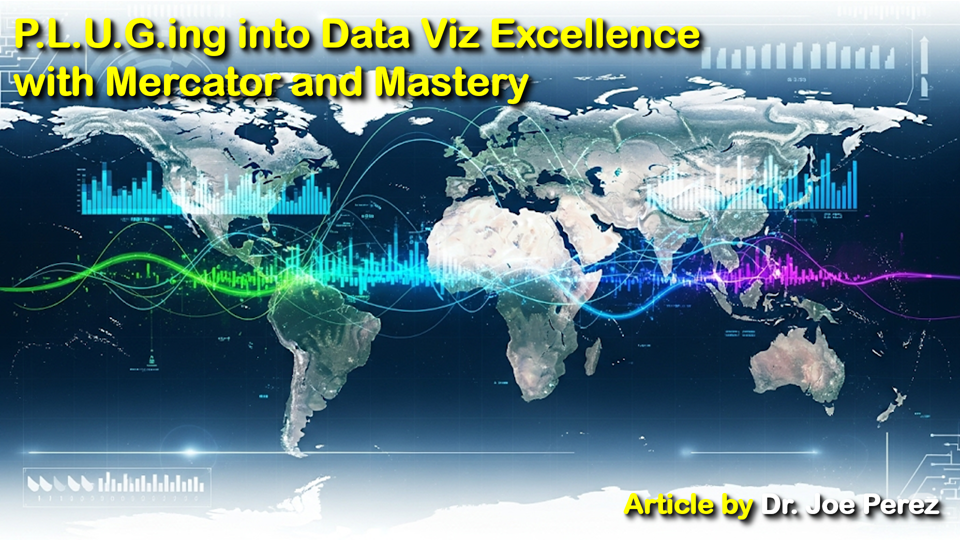 The Mercator Lesson: PLUG the Gaps to Avoid the MISS in Data Visualization
After discovering the significant distortion of Africa's size as depicted in the Mercator projection, it completely changed my thinking about data visualization. The familiar classroom map renders Greenland larger than Africa when actually the USA, China, India, Japan, and most of Europe could easily fit into Africa. In fact, Africa is 14.5 times larger than Greenland! This error illustrates larger issues with data visualization.
Over my career in data analytics, I've seen so many well-intentioned professionals repeat the same type of misrepresentation errors. The consequences of this are serious. When we alter data, we alter reality. Let's talk about the four most dangerous traps, which I call the "MISS" factors, and then we’ll learn how to “PLUG” these visualization leaks.
The MISS Factors: Critical Pitfalls
As polar regions are elongated on the Mercator map, a manipulated scale can distort perception by an enormous degree. Visualization writers who arbitrarily change axis scales or use non-zero baselines can make small variations appear monumental or make gigantic changes appear tiny.
Financial reporting is one of the most frequent instances of scale manipulation. For instance, a company might present a bar chart showing revenue growth over time, but truncating the y-axis to start at a value close to the lowest data point makes growth seem much larger than it actually is. This slight distortion may mislead stakeholders into thinking the company is doing better than it really is. Similarly, in political polls, adjusting the scale of a graph can inflate differences between candidates, influencing public perception in ways that might not line up with the actual data.
Another issue comes up if scales aren’t consistent in different visualizations. Imagine comparing two side-by-side line graphs, one for sales growth and the other for profit margins. If the scales differ significantly, the viewer might incorrectly assume that the trends are comparable in magnitude. This inconsistency can lead to flawed conclusions, especially when the audience lacks the expertise to critically evaluate the visualizations.
Lastly, aspect ratio selection on charts can also influence perception. A steep line on a thin chart may indicate rapid growth, whereas the same data graphed in a wider chart appears much less dramatic. These subtle decisions, more often than not subconscious, can significantly influence how data is viewed.
Even seeing Greenland alone can result in misunderstanding its size. Reporting figures without context can create huge knowledge gaps. Figures exist in context; they require historical trends, market conditions, or similar comparisons to complete the picture.
Without context, it's particularly hard with time-series data. Let's say, for example, you see a chart showing a spike in sales. At first glance, it might look impressive. But with a bit more context (like an expected seasonal bump, sales promotions, or outside factors like economic performance), that spike could be misinterpreted. Anomaly, or sustained growth? Without context, viewers have no option but to assume (generally wrongly).
A second one is omitting appropriate comparisons. A company might say it recorded a 10% market-share increase, which is good until you learn that the industry as a whole recorded a 20% gain. Without this sort of comparison, the data doesn't present the whole picture. To present a one-year result without historical data conceals longer-term trends, and it's difficult to determine if the performance is truly outstanding or just part of an even larger trend.
Context is also important with geographic data. A map illustrating high unemployment in a particular area could be shocking to see, but without contextual information (i.e., population density, industry distribution, or prior unemployment trends) the map can generate overgeneralized or even misleading conclusions. Presenting this layered context is necessary for proper interpretation.
Similar to limiting attention only to specific world-map regions, selecting only specific points yields a biased picture. This is most often presented by conveniently-ignored periods or strategically-picked indicators confirming a predetermined agenda.
Selective sampling is an extremely risky type of distortion because it may go unnoticed by viewers. A company could, for instance, highlight a period of increase while conveniently excluding a subsequent decline. Selectively selecting points, graphics tell a story that convincingly conforms to the author's agenda rather than the full truth. It happens most in advertising and political campaigns, where persuasion is generally more critical than fact.
Second instance: exploitation of outliers to mislead perceptions. Inserting very high or very low outliers has the potential to greatly alter the appearance of trend lines or averages and lead to erroneous conclusions. A quarter of phenomenal sales, for instance, can be extracted and used to generate the perception of continuing success if surrounding quarters are trending downward. Without noticing how data were selected, the audience is introduced to a distorted reality.
Selective sampling can also occur in survey information. Focusing on one group of people or leaving out specific responses can yield biased results in support of a pre-conceived situation. This exercise not only taints the authenticity of the information but also erodes trust in organizations presenting it.
Just as redundant map features can distract from geographic accuracy, excessive chart junk, 3D effects, and superfluous design ornaments can obscure true data narratives.
Excessive decoration is generally the product of a desire to render visualizations more engaging or aesthetically pleasing. To the extent that they're excessive, embellishments can fail by drawing attention away from the data itself. For example, 3D bar charts are great, but they can distort viewers' minds when it comes to the data by making comparative values unstable. Similarly, excessive use of colors, gradients, or patterns will create visual noise that conceals the underlying message.
Another issue: including unnecessary elements, such as overly complex legends, redundant labels, or decorative icons. While these additions may look harmless, they can clutter visualizations and make them harder for audiences to focus on key insights. In some cases, these elements can even introduce confusion, leading to data misinterpretation.
Finally, using animations or interactive features might sometimes hinder understanding instead of enhancing it. While such objects can be helpful for exploring large data collections, they also have the potential to bypass the audience or distract from underlying points. Finding a proper balance between effectiveness and simplicity is key to effective data visualization.
The "PLUG" Solutions: Fixing/"PLUG"-ing Data Visualization Leaks
To counter scale manipulation, maintain proportional relationships in your visualizations. Use zero baselines for bar charts, consistent scales for comparisons, and appropriate aspect ratios. Leverage tools like small multiples when dealing with widely varying magnitudes.
Proportional representation is both a best practices and builds trust. When viewers see a chart with a zero baseline, they can immediately understand the true magnitude of differences between data points. This approach eliminates possible exaggeration and ensures that visualizations accurately reflect underlying data.
Small multiples are particularly useful for keeping datasets proportional with varying scales. Presenting multiple charts side-by-side, each with its own consistent scale, enables viewers to compare trends without being misled by inconsistent axis adjustments. This technique is especially useful when dealing with time-series data, where trends across different categories or regions need to be compared.
Aspect ratio also plays a critical role in proportional representation. A well-chosen aspect ratio ensures that the data is neither stretched nor compressed, preserving the visualization's integrity. This attention to detail might seem minor, but it can have a significant impact on how the data is received and interpreted.
Combat incomplete context with layers of meaningful information. Include trend lines, industry averages, and relevant benchmarks. Include notes that clarify important occurrences or transformations. Consider it as weaving a detailed fabric of comprehension instead of merely capturing a fleeting moment.
Layered context transforms raw data into rich stories. For example, a line chart showing sales growth becomes far more insightful when accompanied by annotations highlighting key events; i.e., product launches or market shifts. These information layers provide the audience with deeper understanding of factors driving the data.
Secondly, use comparative benchmarks. Showing how your data stacks up against industry standards or competitor performance adds valuable dimension to your analysis. This approach both enhances understanding and puts your insights into wider context.
Think of layered context as the foundation of effective storytelling. Providing the "why" behind the "what" allows your readers to make informed choices based upon complete vision of the information.
Address selective sampling by establishing clear criteria for data inclusion and exclusion. Document your methodology transparently. When practical limitations necessitate sampling, clearly communicate your selection process and acknowledge potential biases.
Transparency is key to building trust. Clearly document your methodology, including any limitations or biases. For instance, if you exclude outliers from your analysis, explain why/how this decision impacts results. This level of openness not only enhances credibility but also ensures that your audience can interpret findings accurately.
Finally, universal data inclusion is particularly important in longitudinal studies or time-series data. Omitting some time periods, whether by necessity or lack of data, can significantly alter perceived trends. Excluding a recession period from an economic analysis, for example, might make growth appear more uniform than it actually is. Acknowledging these omissions and their potential impact on the analysis is a critical step in maintaining the integrity of your visualizations.
Counter excessive decoration with elegant minimalism. Every graphic element must have a clear function. Ask: "Is this graphic feature serving to promote understanding or contributing to visual clutter?" Keep Edward Tufte's data-ink ratio optimization principle in mind.
Tufte's "maximizing data-ink ratio" principle is one of the cornerstones of good visualization. The idea is simple: use as much "data ink" (ink used to display data) as possible and just enough "non-data ink" (serving to decorate, not inform) as required. A clean line-chart with minimal gridlines and labels performs much better than a cluttered chart with excessive shading and 3D effects.
Graceful simplicity also involves good use of whitespace. Giving your data room to breathe enhances readability and allows viewers to focus on essential items in the visualization. Thus, being a visual cue, whitespace focuses the audience's attention on the most important parts of the data. Well-balanced design can significantly increase comprehension, making it easier for viewers to derive insights without being overwhelmed.
Furthermore, embracing graceful simplicity involves prioritizing clarity over complexity. When designing visualizations, ask yourself if every element has a function. If it doesn’t contribute anything to the understanding of the data, consider removing it. This is what Tufte's philosophy promotes, where every pixel must have a purpose. Minimizing distractions creates more impactful and memorable visualizations that will reach your audience.
In today's information-overloaded society, the ability to present data simply and effectively is a powerful skill. Sticking with the principle of graceful simplicity not only enhances the clarity of your visualizations but also creates stronger connections with your audience. They will be more likely to react and recall nuggets of insight presented in plain, simple terms.
CONCLUSION: Bringing It Full Circle
Just as the Mercator projection reminds us how easily visual representations can distort reality, these principles serve as our compass for creating honest, effective data visualizations. When we recognize the MISS factors and apply our PLUG solutions, we transform from mere data presenters into trusted data storytellers.
Think about that classroom wall-map. Just because it wasn't visually accurate does not imply that its purpose was to mislead. Those "distortions" served a specific navigational role. Similarly, our primary aim is not to critique every choice in data visualization but to make thoughtful, informed decisions that meet analytical goals while maintaining integrity.
When you create a visualization next, remember Africa and Greenland. Recognize that the way you present data impacts understanding, influences decision-making, and affects outcomes. By addressing these frequent pitfalls in data visualization practices, we can ensure that insights are communicated clearly and honestly to our audience.
In an increasingly data-driven world, the capacity to present information accurately and effectively transcends mere technical skill; it embodies genuine moral responsibility. Let's commit to producing visualizations that not only capture attention but also convey truth.
Tags: Analytics, Big Data
River Horses and Real Decisions: Hippos and Data Stories that Move GovernmentBook of the Month: Igniting the Data Dance When Your Data Governance Program Thinks Like Bamboo